Setup and Basic Styling
July 12, 2015
Motivations
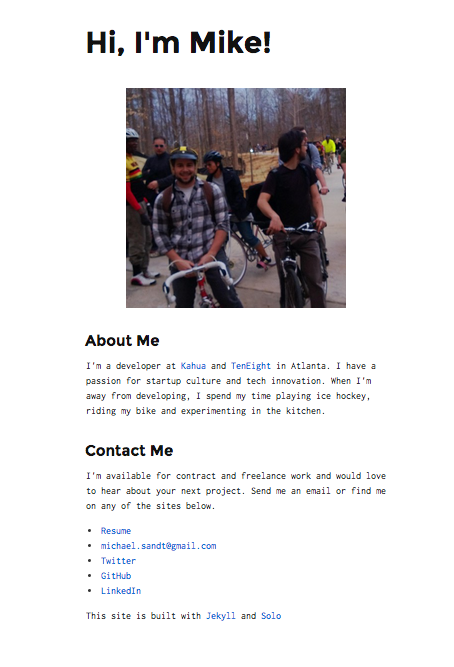
It's been a while since I took a look at my personal site, and even longer since I did any development around it. First a quick look back into the past.

This worked well for providing a bio and contact information but fell severely short when it came to providing blog functionality. As I moved forward in my career as a developer I realized that I not only wanted to start blogging, but needed to leverage it as a tool to help create my own personal brand.
I realized I didn't want to completely throw everything from my old site out. I had already chosen an extendable static site framework with Jekyll which functioned seamlessly with Github's static pages hosting. I felt the easiest choice was to pick a new theme that provided a more conventional UI and a better blogging mechanism.
Picking a New Theme
After scouring the internet for a bit I settled on Kactus as my new theme. It had everything I desired and was easily extendable. Next, the fun part, moving the existing codebase over.
Moving to Kactus
Moving the existing site UI to Kactus was actually fairly simple. Simply clone the Kactus boilerplate and copy the files to the existing personal site folder.
$ git clone https://github.com/nickbalestra/kactus.git
$ cp -fR /kactus /msandt3.github.io
$ cd msandt3.github.io
$ jekyll serve
That's it! The current personal site now runs with the Kactus framework.
Updating the Styles
I had updated the about page to provide a bio, but I wanted to add a link to my twitter in the footer. Just add the html elements and bingo. Simple enough right?
<footer id="footer">
    <div class="copyright">
      <p class="small">© Copyright 2015 Mike Sandt</p>
    </div>
    <div class="icons">
      <a class="twitter" href="https://twitter.com/mikesandt"><span class="icon-twitter"></span></a>
    </div>
</footer>
Turns out some of the default styling for the footer wasn't playing nice with the new elements and caused the twitter icon to fall underneath the copyright block.
![]()
Time to flex those CSS muscles. To solve this I needed to style adjust the display of the footer block and float the copyright and icon elements left and right, respectively.
#footer {
  box-shadow: inset 0 1px 0 #eee;
  padding: 40px 0 0 0;
  margin-top: 100px;
  display: inline-block;
  width: 100%;
}

.copyright {
  float: left;
}

.icons {
  float: right;
}
Boom! And now it looks so much better.
![]()
Going Forward
It was a fun exercise getting the new site up and running but there were several pitfalls in the process that I thought I could adress going forward. First, I'd like to get SASS in the pipeline somewhere. Jekyll actually supports SASS by default and nesting selectors was something I really missed, even for the minimal amount of CSS I touched in getting this project up and running.